Evoke Jewelry
I’ve been a lover of fashion since high school, when I watched runway shows from my laptop and co-ran a fashion Tumblr account. This spurred my decision to create a mini-brand identity for the kind of jewelry brand I’d love to exist (and work with).
I crafted a logo, color palette, type pairings and photo direction to bring the brand voice to life. Then, I created email templates and campaigns to accompany the brand and show that email marketing doesn’t have to be boring.
Brand + Shopify Design

I crafted a mini-brand and email marketing collateral for an imagined jewelry company.
Scope
Logo + Logo Mark
Color Palette
Photo Direction
Email Templates

designing a jewelry company that resonates with millennial women


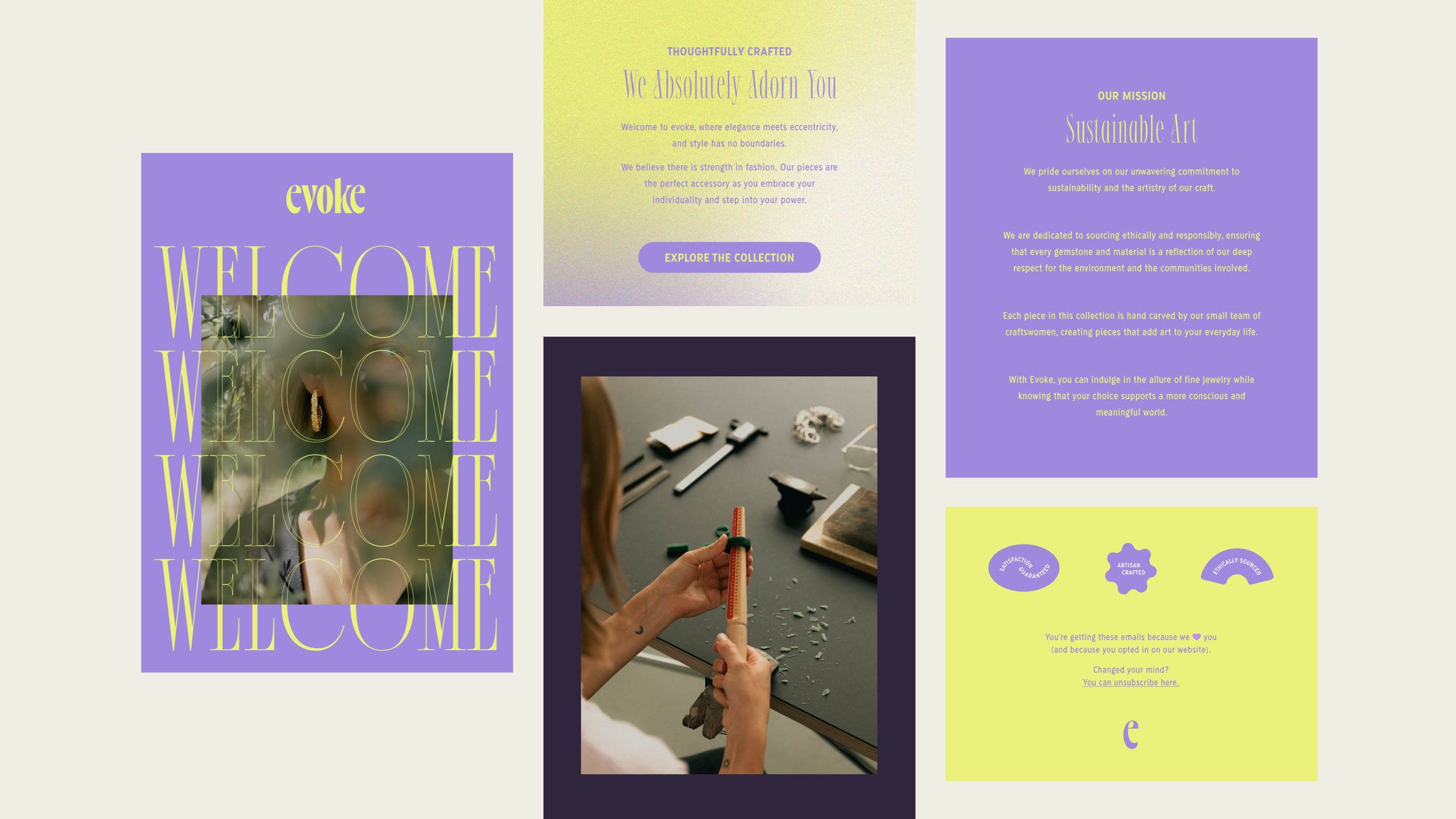
When building out the brand identity for this project, I knew that I wanted the color story to be bold, playful and funky.
Adding Depth with Color
I spent hours experimenting with color until I got the perfect palette for this brand—feminine, but not delicate, refined, but still vibrant.


Death to Stock (Photos)
E-commerce design on its own can only ever get you so far—the supporting elements are just important. I wanted to make sure the photography strengthened this project.
Since I didn’t have access to a photographer or products, it was really important to be intentional with the photos I selected. Dry stock photos were not the vibe here.
So I used Death to Stock to find warm, artistic photos that featured jewelry worn by models, jewelry styled interestingly, and that featured the jewelry-making process.
The result is a collection of photos from different artists that join together to create a cohesive, non-stagnant, brand voice.


