Amanda Bee’s Floral Designs
Brand + Shopify Design
I partnered with Amanda Bee’s Floral Designs to craft a new brand identity that would exude the fun, colorful and unique vibes that set them apart in a sea of floral sameness.
I also redesigned and developed their Shopify site, working with them to refine content, and restructured the site to make it easier for visitors to find what they need, optimizing the checkout process.
I helped Amanda Bee’s Floral Designs better reflect their unique floral design style, stand out from competitors, and made it easier for customers to purchase online.
Services
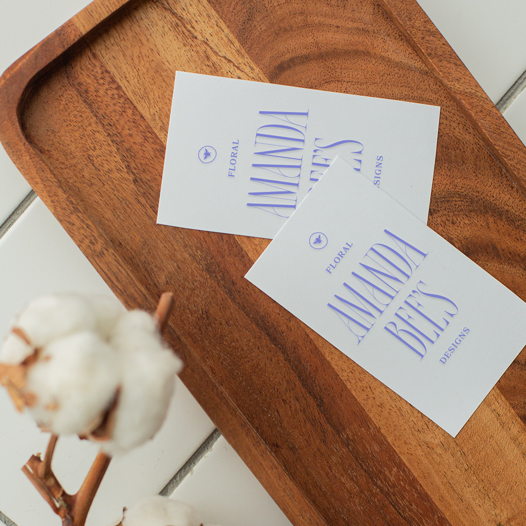
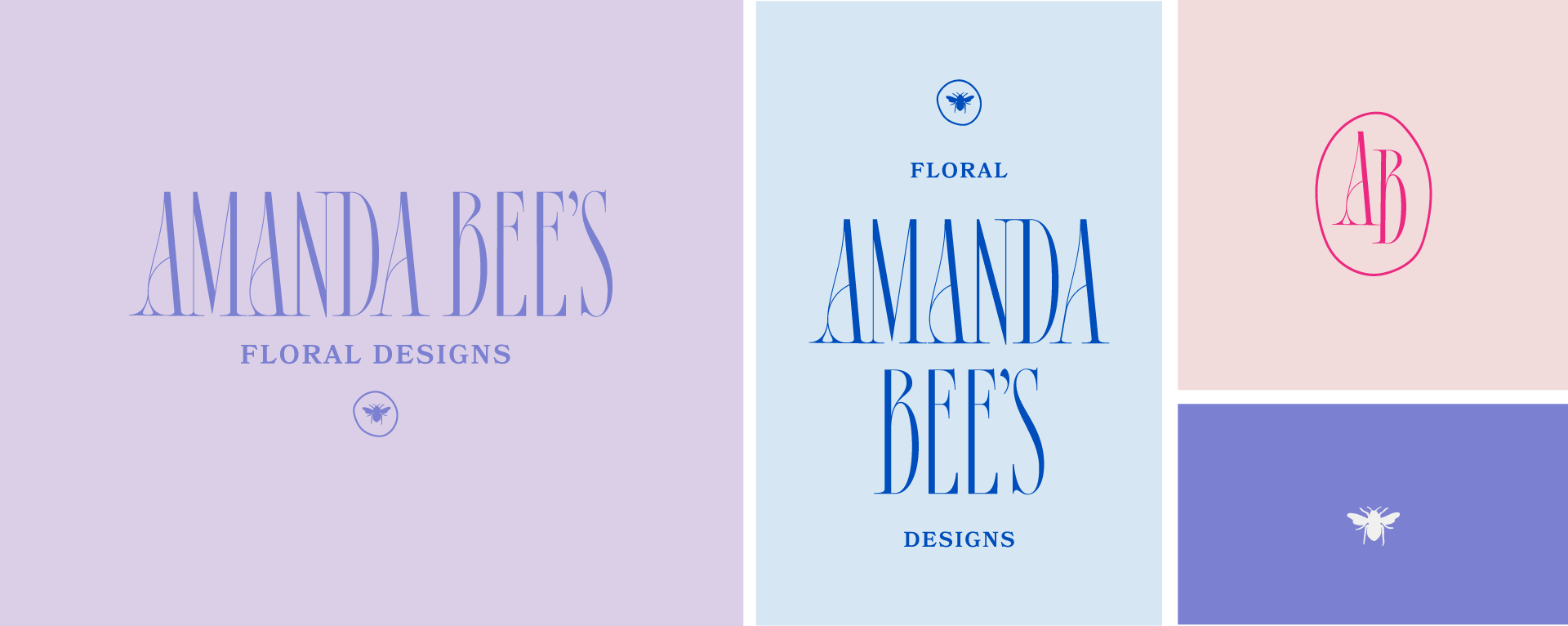
Logo + Logo Mark
Identity Design
Brand Illustrations
Brand Style Guidelines
Shopify Design + Development

helping a one-of-a-kind florist stand out in a sea of sameness


Process
During the discovery phase, we realized that one of the contributing issues to the website’s poor performance was poor positioning.
Customers who found Amanda Bee’s online didn’t know what kind of aesthetic to expect. The original brand identity and website design reflected a very traditional florist, but Amanda Bee’s focus is colorful, vibrant garden-style arrangements.
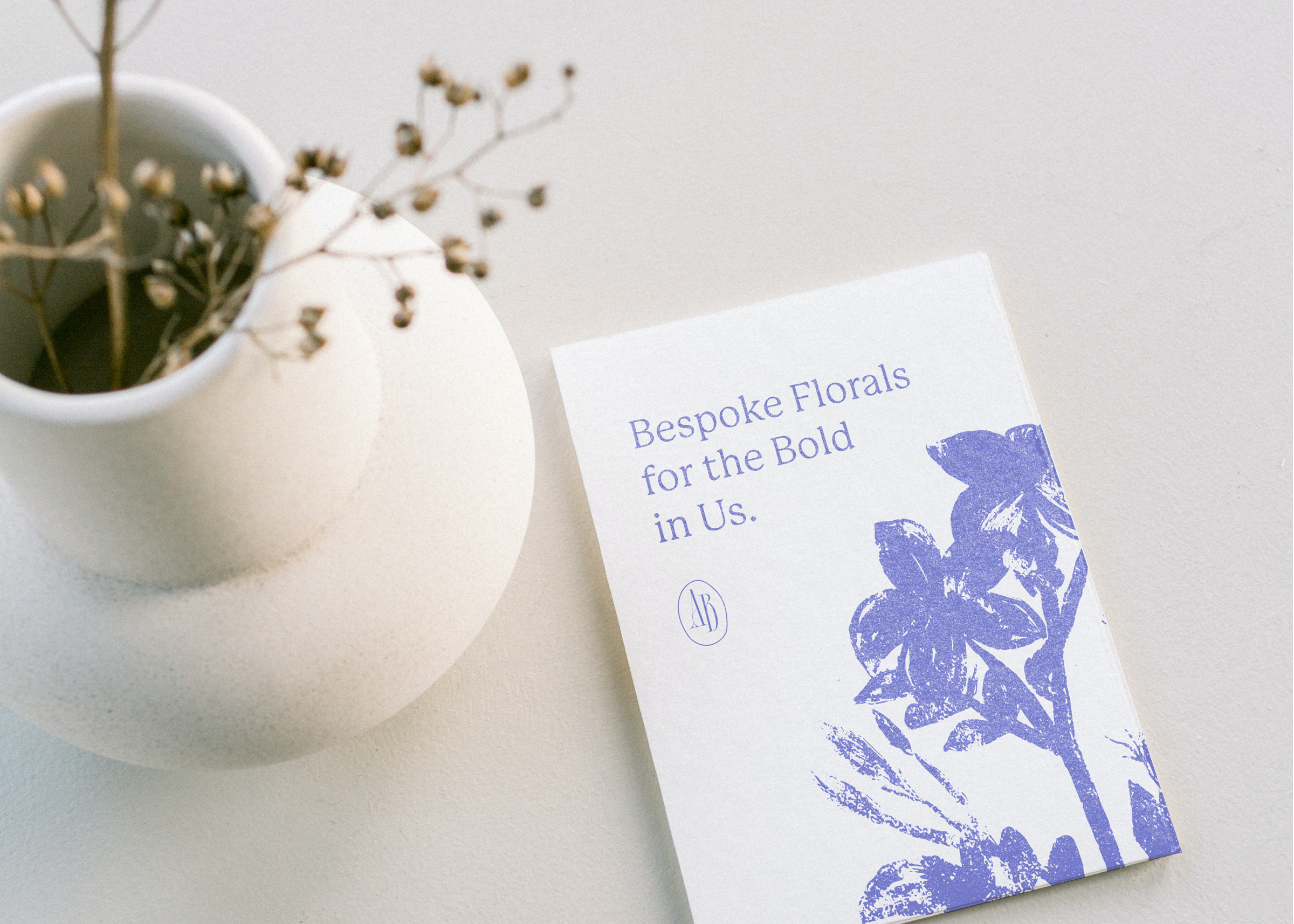
With this in mind, I created a brand identity that included a logo suite, color palette, font selection, brand illustrations, and a brand style guide. Once the new brand was established, I redesigned the Shopify site to reflect the new aesthetic and better convert sessions.
Each phase of the project was accompanied with a live video presentation. This is also how we gathered content and information for the project—making it as easy as possible for the client.
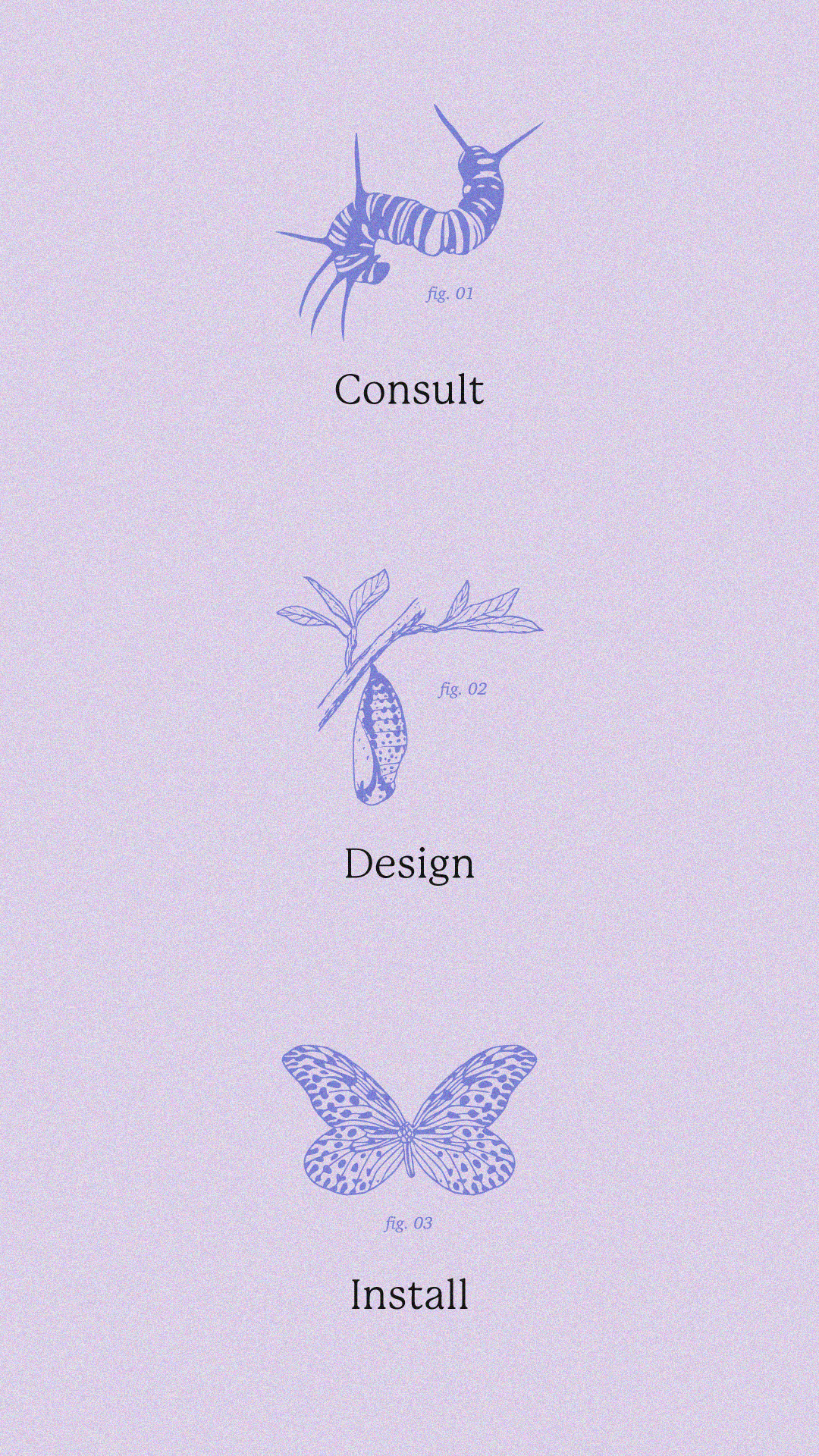
Brand Illustrations
I created two different styles of original brand illustrations for Amanda Bee’s Floral Designs.
The floral illustrations are designed to convey the artistic lens that Amanda creates her arrangements with. There are multiple iterations of this style—larger illustrations that are used to add visual interest, as well as smaller illustrations that can be pieced together to create a pattern.
The insect illustrations are designed specifically as a nod to Amanda’s background in entymology. They’re used to symbolize different meanings throughout branded materials.

KIND WORDS FROM THE CLIENT
“Ashley created something that speaks more to our brand, our target audience and taps into our lux & elegant side.”
Raeanna Rekemeyer, COO